Color shouldn’t be taken lightly.
Whenever I design a logo for someone, I’m always surprised that they usually either a) haven’t given much thought to color or b) don’t really care. Or worse, c) want their logo to be purple because that’s their favorite color. #fail
What most people don’t realize is that color in logo design is incredibly important. It sets the foundation for the company’s branding and how it will be received (or not).
Color and shape happen to be the first two things that the brain notices when you see something. Which is first is debatable, but obviously color is important.
Color is also deeply rooted with emotions. I’m sure you heard of chromotherapy, where light and color are used in healing. Different colors have different wavelengths and have measurable effects on our mood. More on that in a minute.
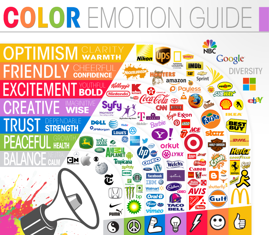
Color communicates important information to us
For example, whenever you go to the grocery store you look for fruit that is colorful and ripe, not brown and rotten. Color can also warn us of danger. If you see an insect or a snake with bright markings on it, your brain automatically goes into fight or flight. We’ve also learned to associate different colors with different things. In our culture, red typically means “danger” or “stop;” green means “safe” and “go.”
Different colors also resonate with different audiences.
For instance, blue is a universally pleasing color; everyone, across all cultures, likes blue. Both men and women like blue. Probably because it is reminiscent of the ocean and the sky—things found in nature—and has a calming effect. Younger audiences tend to prefer bright, bold colors. And muted earth tones appeal more to affluential people.
As I started talking about earlier, colors can greatly affect moods and emotions. Each color has different meanings and associations behind it.
RED
An intense, saturated color, red gives feelings of power, dominance, danger, and excitement. It is also the color of blood, warfare and love. It is an attention-grabbing hue and can even raise heart rate, blood pressure, and body temperature.
Real world example: Target
PINK
Often associated with femininity, pink can be a strong color when highly saturated, or delicate when desaturated. It is fun, flirty, sexy, and romantic.
Real world example: Victoria’s Secret
ORANGE
Also an exciting color, orange gives the impression of youth, creativity, and action. It can be playful and fun, or intense and exciting.
Real world example: Home Depot
YELLOW
Yellow can be somewhat conflicting; some people find it happy and fun, others find it too weak or that it signifies caution. It can create feelings of warmth, confidence, and contentment.
Real world example: McDonald’s
GREEN
Green is almost universally accepted as being associated with nature, earth, and health. It conveys healing, peace, renewal, tranquility, and sometimes prosperity. It’s an obvious choice for any kind of company that wants to portray itself as being environmental or natural.
Real world example: Whole Foods
BLUE
As I’ve noted before, blue is everyone’s favorite color. It represents calm, peace, confidence, loyalty, trust, and success. It is found abundantly in nature, and it can decrease blood pressure and heart rate, and even make someone feel chilled. But the wrong shades of blue, or too much blue, can come across as depressing or cold. It is seen extensively in banks, law, government, and medical industries.
Real world example: JP Morgan Chase
PURPLE
Purple is a somewhat polarizing color; people seem to either love it or hate it, so it should be used carefully. Used in the right way, it can convey a sense of luxury, nobility, and spirituality. Used the wrong way, it can be appear childish (think Barney) or out of touch.
Real world example: Hallmark
BROWN
Brown, another earth tone, can inspire feelings of dependability, trust, depth, richness, and simplicity. It is a rugged, rough color, and looks practical. It’s also a very neutral color which doesn’t offend (or excite).
Real world example: UPS
GREY
Another neutral, grey can be very sophisticated, calm, and respectful. It commands authority, and can look very regal when used appropriately. But at the same time, much like blue, it can appear either impersonal or too corporate.
Real world example: Apple
BLACK
Black is classic, bold, strong, formal, and mysterious. Although it is technically either all the colors combined, or devoid of all color, it still is perceived as a color by our brains and should be treated as such. It is simple and sophisticated, but can be boring if not used correctly.
Real world example: Nike
WHITE
Like black, it can be argued if this is a color or not. White infers purity, innocence, simplicity, and truth. When used in logos it would be regarded as white space, but still creates a shape which is filled with this color.
Real world example: World Wildlife Foundation
Choose carefully
As you can see, there is a wide gamut of colors to choose from for your logo design, and the options should be discussed carefully with your designer. Hopefully this sheds some light into what goes on in designers’ heads as they try to come up with a viable color option for your business, and there are obvious more correct solutions for your situation and less correct ones.
What about you?
What’s your favorite color, and why? How did you come to your current logo’s color?
Sheila Patterson is the owner and Creative Director behind Apex Creative. GCU professor by day, brand identity expert by night, she loves all things related to design. When she's not creating amazing logos and websites, you can find Sheila tormenting her husband and two feline furbabies, catching the latest Game of Thrones episode, or reading a good book.
Naps are nice too.


7 Comments. Leave new
I like that you included the debate on whether or not white and black are actually colors, since they are either the absence or presence of all colors.
Thanks for reading, Chauncey!
You’re right, according to color theory black/white are considered colors. As you probably know, with additive colors, all the colors together=white, whereas with subtractive colors, it’s the opposite. Kinda confusing, try explaining that to a client 🙂
Until print finally goes away completely, a strong b/w logo is still important, especially for clients whose business plan is geared to local markets …daily and weekly print insertions.
Also, while not to diminish the importance of color, seeing a b/w logo image always helps me to distinguish the negative spaces …always a good exercise if only to make sure there’s no unintended consequences in play.
Hey Paul, thanks for reading and for your comments! I actually think that, despite whether print is here to stay or not, logos should always work in black and white first.
As one of my design teachers always said, if it doesn’t work in black and white, it doesn’t work at all. The concept and shape are the most important thing in logo design, always.
While a logo should be strong enough to stand on it’s own in black and or greyscale, these days a designer should begin by thinking of the color or colors that best represent the mark, logotype, etc. as a company. We live in a digital age where business cards or a full stationary package can be printed full color without incurring a large cost. The first representation that most people will then develop how they “feel” about a company will normally be a visit to their website where unless they want to portray a completely clean minimalist feeling will be in color.
Thanks for reading, Joel! I agree, nowadays color is more important than ever, especially with the ease and affordability of full color printing. Like you said, so many people make snap judgements about brands based, among many things, color.
[…] Color & Logos […]