Quick, what does the Apple logo, a seashell, and the Parthenon have in common?
They all use the Golden Ratio, also known as the Golden section, Golden mean, or the Divine Proportion. It is similar to the Rule of Thirds and closely follows the Fibonacci sequence (1, 1, 2, 3, 5, 8…)
So, what the heck is this Golden Ratio?
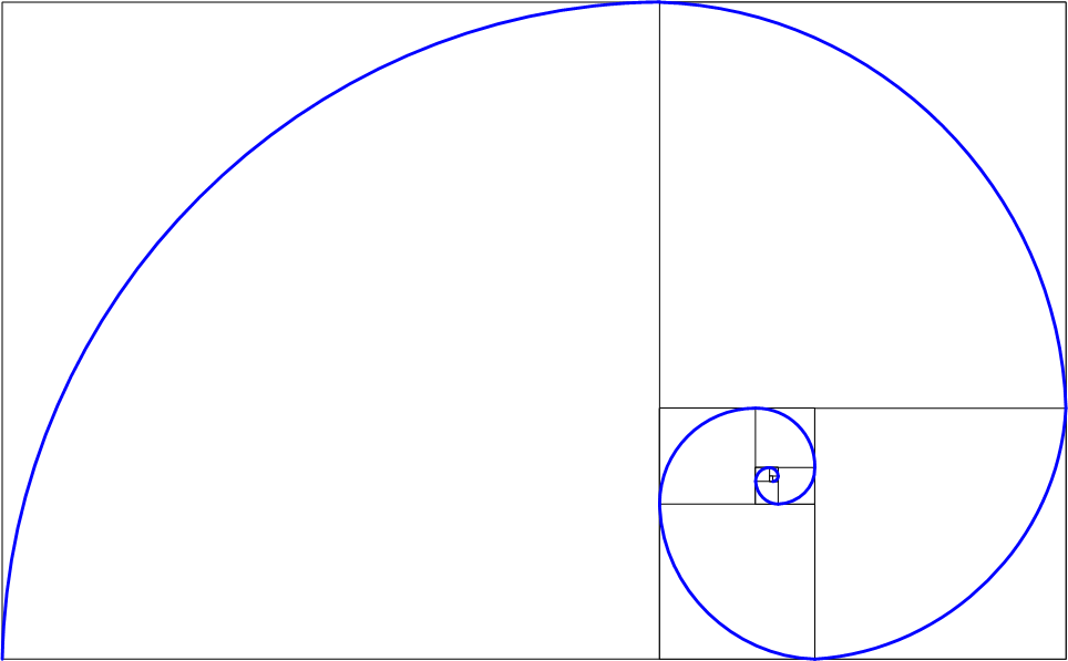
And why should you care? The Golden Ratio is simply a mathematical number, that when rounded, equals approximately 1.618. If you had a rectangle, the longer part divided by the shorter part would equal the whole length divided by the longer part. When drawn together in a series of squares and rectangles, it creates a spiral.
Did I lose you already?
You should care about this particular ratio because it’s found everywhere: nature, art, design, and architecture have all used this magic proportion. Even the human face and body encompasses the Golden dimensions. This particular ratio is considered universally balanced and pleasing to the eye, across all time, cultures, and platforms.
The golden ratio is found practically everywhere. Click To Tweet
The Golden Ratio is important in graphic design because…
Simply put, it means that design is just as much a science as it is an art.
It is, in part, why design works.
Graphic design is just as much a science as it is an art. Click To Tweet
Now, I’m not saying that all design has to use some form of the Golden ratio to be successful. But oftentimes, good design follows some form of this ratio somewhere.
This can range from how columns on a website are split up, to where text falls on a poster, to the shape of a logo. Whether it’s ever on purpose or a happy accident is up for debate.
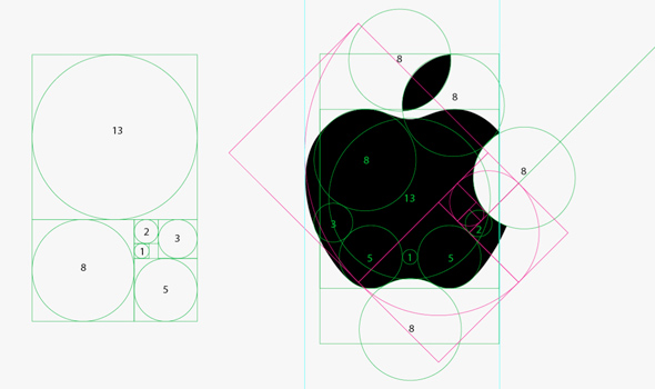
For example, the famous Apple logo uses a ratio of 1:1.618. While the designer, Rob Janoff, maintains that this was not intentional, the fact that 1) it just happened to be those exact measurements and 2) the Apple brand and logo are enormously (and freakishly) popular, I think it’s safe to say that the ratio has some type of innate appeal.
The Mona Lisa is argued to incorporate aspects of these numbers, as well as a variety of other famous works.
Past and present artists, designers, and architectures have recognized the power of this secret and have created accordingly.
Even in my own designs I’m exploring different ways of using the Golden mean.
A recent logo concept I’m working on incorporates a sun-like shape with 8 rays spiraling out. I intentionally followed the Golden spiral. The client and I both agree this is a winner, and we are both surprised at how friendly this shape is, despite its sharp edges.
At other times when I’m feeling stuck, this trusty ratio has come in handy and has been a lifesaver. Many times, while looking for inspiration, I’ll notice that the designs which seem to draw me the most happen to have elements of the Golden section embedded somewhere in their composition.
This all just goes to show that subconsciously, the Golden ratio is attractive, even when consciously it shouldn’t always make sense. Which is powerful design.
So what do you think?
Is the golden ratio secret overused or underappreciated?
Have you ever come across a particularly good (or bad) use of it?




8 Comments. Leave new
I’m a fan of the golden mean and proportioning systems in design. I’ve written about the golden mean, root two rectangles, the law of thirds, and rabatement in my book,
“Geometry of Design.” Proportioning systems play a role in graphic design, industrial design, architecture, and fine art. The math is simple and the results are spectacular. Thanks for the analysis of the Apple logo.
Kim Elam
Thanks for reading! I’ll have to be sure to check out your book, sounds interesting 🙂
Great Article!!:)
Very interesting. I was familiar with the Fibonacci sequence yet never thought to apply the idea to design. I’m not really sure how I would do that but something I’ll consider for future work. Thanks for the read 🙂
Sheila…if you don’t mind my asking, did you use a plugin for the accordion (expanding boxes) on your “About” page? Would you mind sharing with me which one? I had tried one in the past but it was buggy so I removed it from my site. I’ve been looking for another option. Thanks for any suggestions. Love your site by the way.
Hi Derek, thank you so much for reading! Yes the Fibonacci sequence is a very good tool to have in our back pocket 🙂
Actually, the accordion is part of the theme I’m using, it’s called Gala, available on Theme Forest. Sorry it’s not an actual plugin, it is pretty cool!
Yes it is pretty cool. I appreciate your response on the accordion/theme. Themeforest has some nice stuff. Now that you mention it, maybe I’ll check one of their sister sites for an accordion. Thanks 🙂
You’re so cool! I do not believe I have read through anything
like that before. So good to discover somebody with genuine thoughts on this subject matter.
Seriously.. thank you for starting this up. This web site is
one thing that is required on the web, someone with a bit of originality!
I heard of the golden ratio, but never thought of its application in so many ways and specially to graphic design. Quite an eye opener. I really wanted to see how exactly you used the golden ratio to create the Array logo..similar to how you showed the Apple logo. Awesome site and blog!