I’ll let you in on a little secret.
Logo design used to be my least favorite thing in the world. Used to be. Now it’s starting to grow on me.
Sure, I love a good logo. Who doesn’t? But designing them…for some reason that’s the Holy Grail of good design. But for me that’s always been an area where I’ve lacked real confidence. Why? Probably because of the amount of weight that one little symbol can carry…I mean hello, it’s only a company’s entire identity wrapped up in that one simple shape.
And for some reason a logo design brings with it, for better or for worse, a snap judgment from people. They either think your logo is great, amazing, or that your logo sucks. No pressure, right? Right.
So why am I all of a sudden digging what once made me break out in a cold sweat?
For one, because it is a chance to put myself really out there and design something amazing. It’s a challenge, but the reward is tenfold. And it’s exciting. I love designing a logo for a brand spanking new business. I get to be a part of their branding, their company’s identity from square one. What an honor!
The client
Recently I had the honor of designing a new logo for a start-up company dealing in drywall and interior space designing. Now this start-up company was special because the man behind it specialized in almost everything associated with drywalling; he was basically a one-stop-shop for all your drywall repair and installation needs. He also found a niche market in which everyone he did work for needed some specific space problem solved; he helped provide that solution with vision and creativity.
For example, one of his clients wanted to redesign the space inside of their garage. With his help they turned it into a 50′s style vintage cafe. But it was still a garage. How cool is that?
Since this new client was attempting to start up his own business, the very first order of business he needed to get done was create his company’s identity. And the best way to start doing that is with a custom designed logo from yours truly. He needed something that would bestow professionalism, and also communicate his unique talent for working with and designing interior spaces. I told him no problem, that is what I specialize in; creating unique voices for companies and their identities.
The only problem I was having was the name he was throwing around: Unlimited Design Concepts.
Now why would I pick a fight with the poor name? Well, first, alphabetically the name would be at the bottom of any list (“Unlimited…”). Secondly, it just flowed off the tongue funny. Thirdly, no one puts “unlimited” first. It’s always at the end.
Hold my tongue?
Now this is a tough one; should I let the owner’s choice of a name just be and not ask questions, or should I bring these potential problems to his attention?
I chose to just throw it out there, and see what the owner thought about just switching the words around, so that “unlimited” was at the end like people would expect. He was incredibly happy and grateful that I caught those potential problems, and told me absolutely to design a logo instead for “Design Concepts Unlimited“. After a sigh of relief, I got to work.
The competition
As usual, first order of business: research into local competition. Now at this step not only do I scope out other local businesses in the same industry, I also take time to read whatever I can find about them and see what they’re really all about. Essentially, I try and get a feel for them.
Luckily for my client, the results weren’t always pretty, and most of the competitors broke the rules of good logo design. I knew that whatever I designed, even if I didn’t put a lot of effort in or came up with something mediocre, could easily be better than the logo designs that I saw. But that’s the thing; I didn’t want to settle. I wanted to make something amazing.
Thinking outside of the box
The first few concepts and ideas I came up with were the usual; paintbrush, construction equipment, that kind of thing. But then I started thinking outside the box.
Since some of the key phrases my client kept saying in the consultation were “vision” and “solutions,” I began thinking of problem solving. After some sketches I came up with stronger concepts; a puzzle piece in the shape of a house, or a house coming out of the “d.”
The funny thing about design is, sometimes the last idea you come up with, the one out of the blue, the wild card, gets chosen.
When it was almost time to present, I had 3 solid concepts. But I felt like I needed something in addition to show, just to give a bit more variety.
I had this one idea of something that looked like the implied shape of a corner in the back of my mind, so I threw it in. I never thought in a million years it would take precedence over my carefully brainstormed and designed concepts. But guess what? It did.
And the winner is…

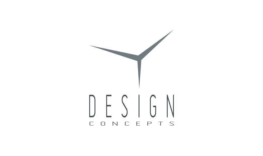
My client initially loved most of them, but he was really blown away by the corner-space one. He felt that it was the one that closest reflected his desire for his company to be seen as clean, straightforward, skilled, professional, and visionary.
We decided to go with that design, and it was so simple and so clean practically no finishing touches were needed, just pinpointing the right typeface to accompany it. I originally was playing around with Futura, but ended up going with Miso, which looked very modern and minimal, yet constructivist in nature.
To me the finished logo is almost frighteningly simple; to be honest, I have had fears of people accusing me of copying Mercedes or something like that. But I know where the idea came from, I know what concept it stands for, I know I designed it. I suppose that’s also the sign of success, when something is so amazing people stop and wonder if they’ve seen it before.
What do you think?
Is it possible for a logo to be too simple? Is deja vu a sign of remarkableness or simply familiarity?


5 Comments. Leave new
Sheila, I really like your study on the drywall logo design. I feel like you had all the opportunity to design a great logo, considering your competition was so poor. You nailed it, I also really liked the “DCU” logo that has the letters intertwining. Great job! Can’t wait to keep reading!
I didn’t think of Mercedes until you mentioned it. Personally I think it fits the best because there are a lot of corners in a room 🙂
In contrary to the above poster I think the DCU logo is the weakest of the four. While not a bad logo on its own, it looks too much like a college football logo for me to really associate it with interior design.
Thanks for your comment, Kyle! I’m glad other people don’t think of Mercedes right off the bat, I’m paranoid about my designs looking anything remotely like someone else’s. I agree, the monogram isn’t the most appropriate for the nature of this particular business; my aim was to simply provide the client with as variable options as possible and go from there. You never know what direction a design might go!
I had to laugh reading about clients picking the “wildcard” logo. In my earlier design days, too often the client would end up picking the weakest concept… that last-minute quick logo that I’d created just to give the client more choices.
Unfortunately, then you have to live with that choice and develop it into the finished logo. I learned my lesson: to NEVER present any weak, underdeveloped ideas, because the client will always pick that one! It’s a rule!
Oh, and always avoid using the puzzle pieces cliché! Ugh… 😉
I must say, I’ve found myself in the same boat at times, when after spending hours agonising over a logo design, something clear and clean pops into the mind, and IT JUST HAPPENS. I usually question this, thinking it can’t possibly be so simple. It’s too easy. But it works, and the client loves it. Clarity wins 9 times out of 10. The one that doesn’t work, usually leaves me feeling why I showed it to the client!! Great article Sheila.