Logo Design to be Featured in Logo Lounge Vol 9
Great news, everyone! As many of you know, I don’t often (if ever) toot my own horn, but I thought this required a special tooting!
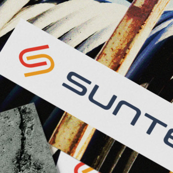
Great news, everyone! As many of you know, I don’t often (if ever) toot my own horn, but I thought this required a special tooting!
Many people, and rightfully so, aren’t aware of the sheer amount of time and effort that goes into creating a strong brand identity—aka, a logo. Understandably, many potential clients are stunned when I tell them my logo design prices (let’s just say a logo should cost you more than a nice dinner.) In fact, most professional designers would agree: a logo takes a lot of time, thought, skill, and effort. All of this amounts to…

Color shouldn’t be taken lightly. Whenever I design a logo for someone, I’m always surprised that they usually either a) haven’t given much thought to color or b) don’t really care. Or worse, c) want their logo to be purple because that’s their favorite color. #fail What most people don’t realize is that color in logo design is incredibly important. It sets the foundation for the company’s branding and how it will be received (or…
Panic! Okay, maybe not quite yet. I’ve run into this a couple of times, mostly after I’d designed a new logo for a client. Once or twice they’ve come back to me, worried that their logo looked like another logo floating around out there.
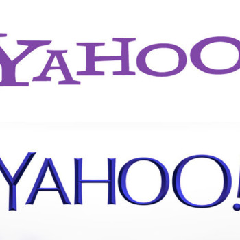
Like everyone else, I’m throwing my two cents in at Yahoo’s decision to update its logo. And like everyone else, I must admit, I’m becoming so used to these sterile logo redesigns that it almost doesn’t even elicit a response from me. A “meh” will suffice.
What makes a good logo? When we’re talking about good logo design versus bad logo design, it’s helpful to know what we’re talking about exactly. If you ask 10 different designers what qualifies as a good logo, you’ll likely get 10 different answers. But if you keep digging, eventually you’ll start hearing a lot of the same thing being said.

I just walked away from an $8,000 project. “What, are you crazy?!” Is probably what you’re thinking right now. Yes, I am crazy. Crazy enough to put my sanity and happiness before profits. The reason I want to share this with you is to encourage all other designers out there that it’s okay to say “no” sometimes. In fact, the ability to say “no” is an important part of what we do. But if you’re…

So after a long hiatus, you are now ready for the final piece of this branding/logo/identity puzzle, right? Right. I do apologize for the long delay, things have gotten quite busy around here, which is good for me (but bad for you, my readers!). So, let’s jump right in, shall we? Picking up where we left off in this 3 part miniseries, today’s focus is on the third and final “step” in building a comprehensive…

Since you now have a firm grasp on what branding is all about… …it’s time to move on to the all-important topic of logos. I bet you’re wondering: What is a logo exactly? How is it different from branding or identity? In this three part miniseries, I will continue to deconstruct each of these “steps,” explain their differences, their importance, and meaning of each. This week, we are continuing on to Step 2: Logos. …
You’ve heard the terms thrown around a lot. Branding. Logos. Identity. What do they all mean? How do they differ? Does their order matter? And if so, which came first, the chicken or the egg? In this 3 part miniseries, I will detail each of these “steps” and explain their differences, their importance, and meaning of each. This week, allow me to introduce Step 1: Branding. Step 1) Branding: the emotional perception or idea…