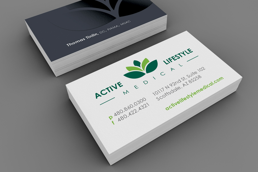
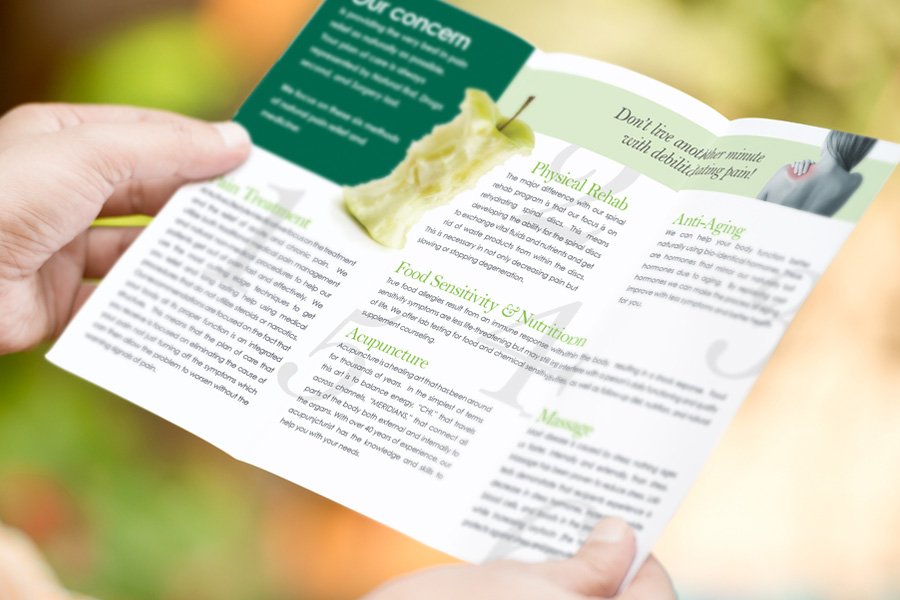
• Work
  • Blog

Active Lifestyle

Project Details

After practicing their unique medicine for years, Active Lifestyle Medical finally decided they needed a real logo if they were to continue expansion. They also were in need of professional business cards, trifolds, and other business collateral.

Company Website

Services:

  • Brand Development & Positioning
  • Business Identity Design
  • Logo Design
  • Color Palette Development
  • Typographic Standards
  • Photographic & Illustration Style
  • Integrated Brand Systems
  • Brochure & Collateral Design

Client

Active Lifestyle is a growing practice in Scottsdale dedicated to the combination of Eastern and Western medicine in order to provide a more holistic healing approach for a variety of health concerns. With 20+ years of experience and 7 employees, this small office treats a variety of patients, from children to teens, to adults of all ages.

Goals

When I first met with Active Lifestyle, they didn’t even have a formal logo, so it was clear that this would be a priority.

I found their business model intriguing: rather than mask the symptoms of patients, Active Lifestyle sought to address the underlying problems. Their philosophy was to do good, and not harm. They wanted their designs to convey that they were natural, healthy, balanced, and offered hope and healing. Their audience was obviously people in need of some sort of physical relief; they saw a lot of patients who were experiencing chronic illness and pain, so it was important for me to address that visually.

During my research for their logo, I kept coming back to the concept of life within plants. Active Lifestyle was a big advocate of holistic and Eastern medicine, as well as eating and living in a healthy manner. This led to the deeper discovery of the lotus plant and the symbology surrounding it. Lotus flowers begin in the mud at the bottom of a lake, and have to work their way up towards the light to fully blossom. I felt that was a perfect analogy for the path that Active’s patients go on.

A healing spectrum of greens were used in conjunction with this symbol, and the icon was paired with Century Gothic to maintain a clean, modern look.

Ready to elevate your brand?

If you like what you’ve seen and think we may be a good fit, let’s get started!

Get in touch

Or, look at some more projects

Suntel

Suntel

Roots of Life

Roots of Life

CAP

CAP

Phoenix Seminary

Phoenix Seminary

© 2016 Apex Creative. All rights reserved.