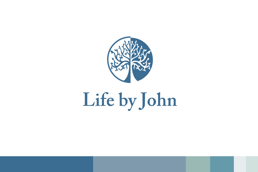
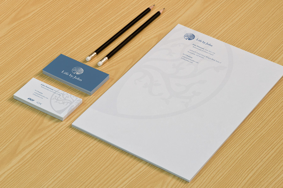
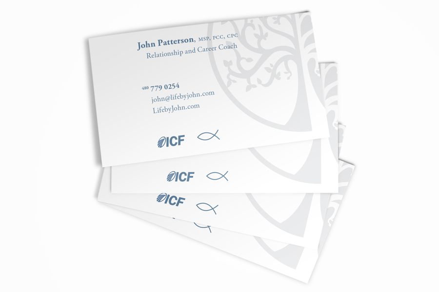
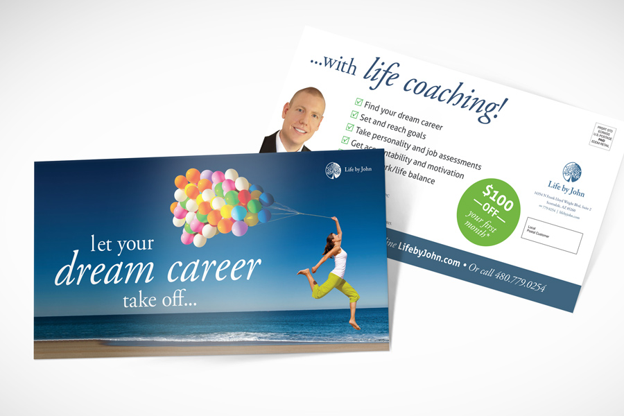
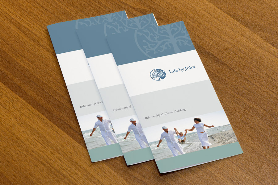
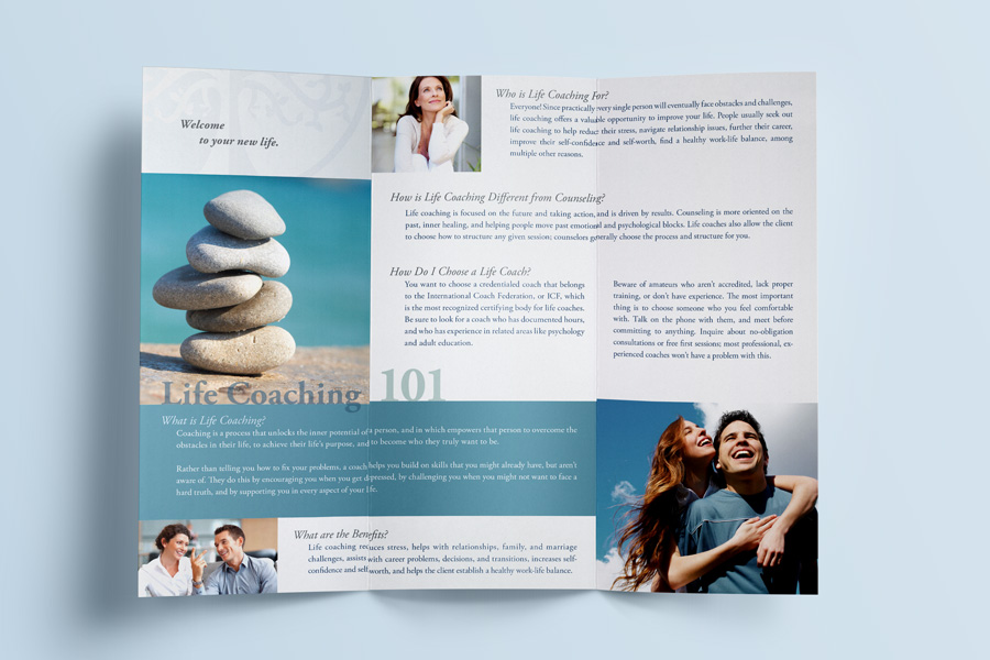
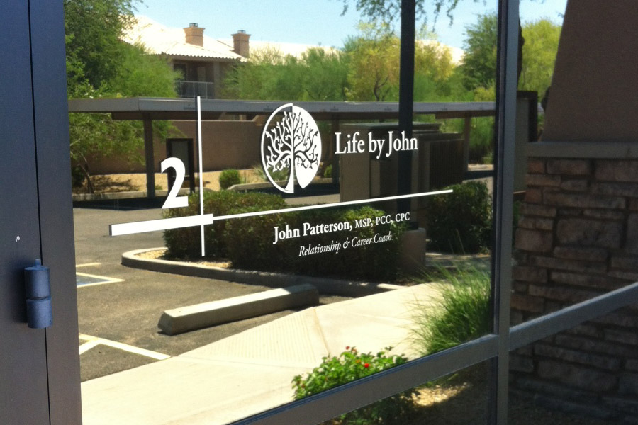
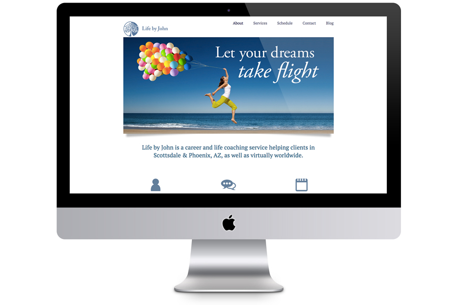
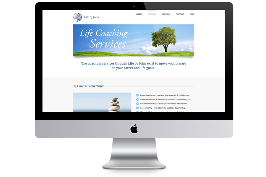
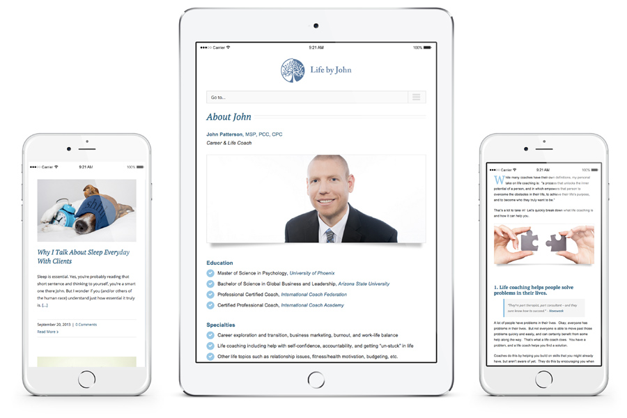
• Work
  • Blog

Life by John

Project Details

Practicing in North Scottsdale, Life by John specializes in relationship and career life coaching. This new start-up needed everything: branding, logo design, business cards, letterhead, trifolds, postcards, and, of course, a responsive website.

Company Website

Services:

  • Brand Development & Positioning
  • Business Identity Design
  • Naming
  • Logo Design
  • Color Palette Development
  • Typographic Standards
  • Photographic & Illustration Style
  • Integrated Brand Systems
  • Brochure & Collateral Design
  • Direct Mail Design
  • Website Design & Development
  • Search Engine Optimization
  • Email Design and Marketing

Client

Utilizing a practical and authentic approach, John helps others face their challenges through life coaching. While his practice has evolved over the years, John remains true to his personal values and convictions—providing effective coaching to his clients by listening to them and helping them uncover answers to their problems.

Goals

John Patterson (my husband) wanted to start his dream of becoming a life coach. Once he got the appropriate degree and accreditation, he needed a professional business identity.

He was frustrated with the amount of amateur life coaches who advertised themselves as professional when they did little more than provide advice. He wanted to distinguish himself from those who took a two-hour class to get certified, versus him going to school for several years.

John thought it was important that his new logo capture what it was that he provided clients: an effective, authentic, caring, professional experience that was reasonably priced.

During my initial concept exploration, I came across the idea of the tree of life, and incorporated that into a circular, reversed out form, reminiscent of old world coins. John loved the idea, and I paired it with Adobe Garamond Pro, a very traditional yet elegant typeface. Finally, we decided on a neutral blue as his main brand color, since it is very calming, healing, and universally appealing to both men and women.

The rest of his materials follow the same line of modern, clean, and fresh but traditional. Along with his basic business card and letterhead, I also designed a simple trifold which doubles as an introduction to both Life by John and life coaching in general, since it is a relatively new profession. Finally we worked on his website, which had to be clean and welcoming, but also pack a lot of information and be responsive.

I was very impressed with the amount of attention to detail that Sheila gave my project. She collaborated with me about the direction of my branding, and listened intently to my feedback. I am extremely happy with the resulting logo design, stationary, materials, and website. Overall, I feel as if my new identity and supporting designs played a significant role in the success of my business. I continually get compliments on all the designs that Sheila has done for me, I cannot thank her enough!

John P.owner, Life by John

Ready to elevate your brand?

If you like what you’ve seen and think we may be a good fit, let’s get started!

Get in touch

Or, look at some more projects

McDowell Enterprises

McDowell Enterprises

Roots of Life

Roots of Life

Misc Design

Misc Design

Active Lifestyle

Active Lifestyle

© 2016 Apex Creative. All rights reserved.