Project Overview
This family business, which started over 35 years ago, needed an updated look to keep up with the times. They required a custom logo design, branding and style guidelines, business identity, and a website.


This family business, which started over 35 years ago, needed an updated look to keep up with the times. They required a custom logo design, branding and style guidelines, business identity, and a website.
Services:
McDowell Enterprises, a family business, has been open since 1980. With over 150 employees, they are one of the Valley’s premier real estate development companies with a focus in medical facilities.
One of the firm’s key partners came to me in need of a new website. He felt that the company’s old site was dated and difficult to navigate and update.
During our initial consultation, it became clear that McDowell Enterprises would also benefit from an updated logo and identity collateral as well, for many of the same reasons.
Altogether, they were looking for a complete brand overhaul that was clean, organized, and made them look competent. Since their key market included middle-aged doctors and investors from across the globe, it was important that their new branding look professional, trustworthy, and conveyed confidence, as well as recognizable across different cultures.
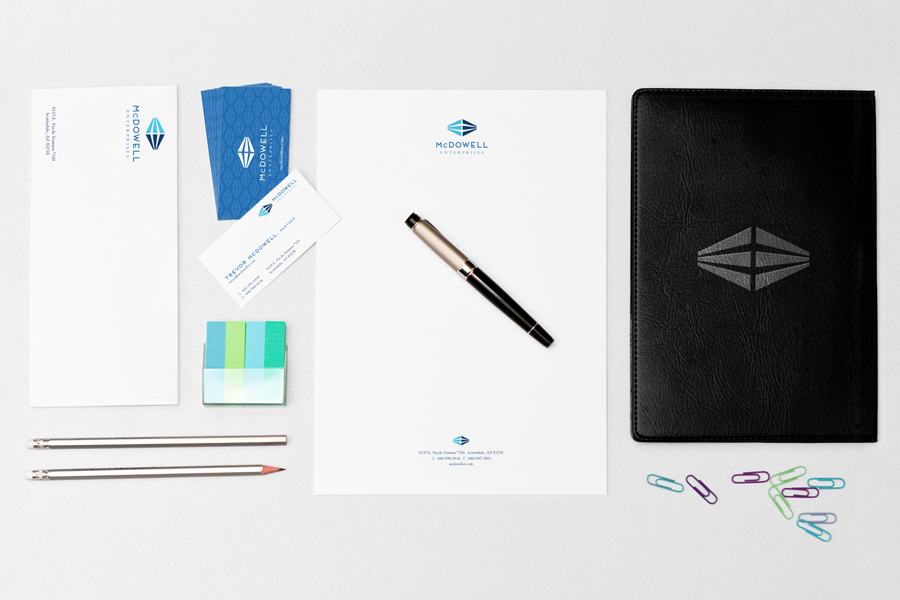
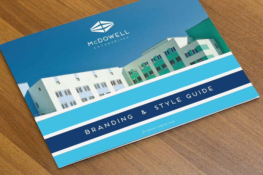
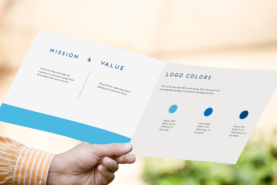
The final logo, reminiscent of a medical building, has a solid foundation and conveys strength, drawing modern lines into the future. The color palette is bright and colorful, with the logo hues mostly in the blue range, which is a universally appealing color. Their new business collateral is clean and professional, accompanied by a style guide for internal usage so that all employees can help keep their new brand consistent.
If you like what you’ve seen and think we may be a good fit, let’s get started!