Project Details
Scottsdale Kempo Club, based on the Hawaiian style of karate, teaches its students practical self-defense in a traditional martial arts environment


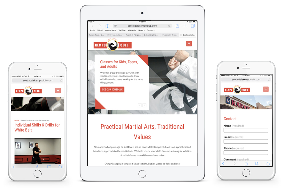
Scottsdale Kempo Club, based on the Hawaiian style of karate, teaches its students practical self-defense in a traditional martial arts environment
Services:
The owners of this new kempo start-up have been doing martial arts collectively for over 20 years. They offer classes and training for all ages, skill levels, and goals. Whether a student wants to get fit, prevent bullying, or learn self-defense, SKC has something for everyone.
Seth Moylan and Blaine Miller contacted me to help brand their new company. Having just broken away from Z Ultimate, they were looking to create a separate identity from their former partner.
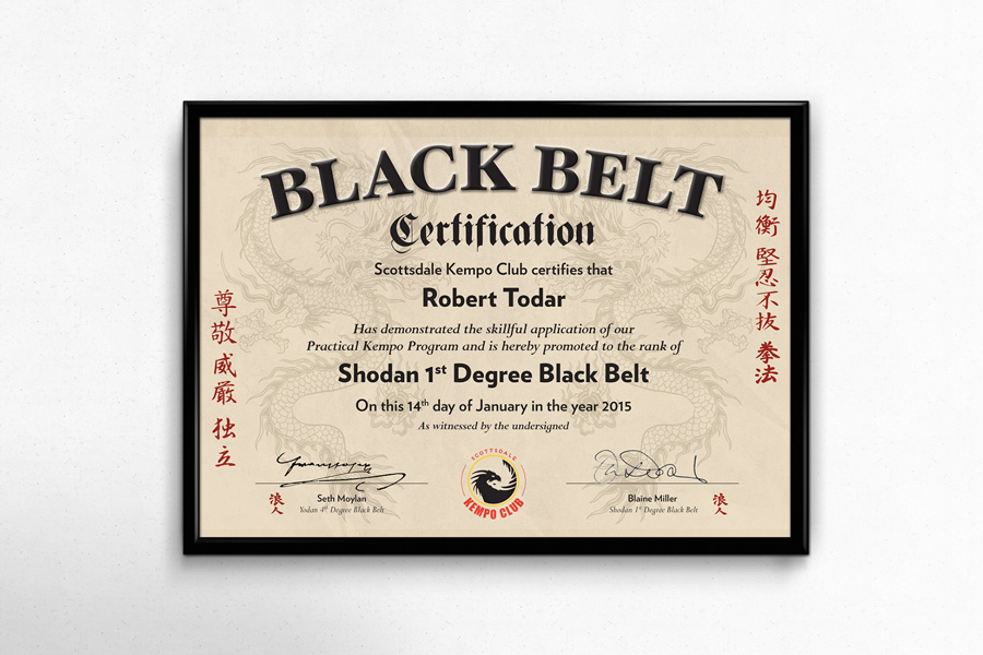
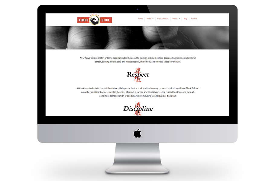
Both owners realized the importance of having a strong brand to start out with, and knew they couldn’t do much until they had a viable logo, marketing materials, and website. Seth and Blaine wanted their new brand to promise a dynamic, energetic experience to both new and current students.
It had to appeal to kids as well as adults, since children made up the lion-share of their students, but it was adults with the purchasing power. They wanted the logo to be edgy, upbeat, intense, and convey competence. Although they didn’t feel that they were competing so much with other martial arts schools as much as alternative activities, like soccer or baseball, I knew it was important to set them apart visually from similar studios.
After exploring the stereotypical karate concepts (punching fist, kicking guy…), I came across the idea of incorporating dragons into a yin-yang. The symbology is strong, as both the yin-yang and mythical dragons are closely tied to Eastern culture and legend. The dragons in particular encapsulate a martial artist gaining all knowledge and power in his craft.
I chose a very simple color scheme for their logo, based mostly on the black and white aspect to stay true to the original yin-yang, coupled with primary color of red, blue, and yellow.
We love our new logo! All of our students and prospects have given us positive feedback and think it’s really cool. We like that our new logo is simple, clean, and original. We also appreciated the complete logo package Sheila provided, which included horizontal and vertical layouts, as well as various color options that fit within our brand; we have everything we need. She was friendly and responsive to our needs– I would highly recommend working with her!Blaine M.co-owner and instructor, SKC
If you like what you’ve seen and think we may be a good fit, let’s get started!