• Work
  • Blog

Tag: simple

Home Tag: simple

The 10 Logo Commandments

July 19, 2013SheilaLogo Designbad logos, color, creative, custom, good logos, graphic design, Illustrator, Logo Design, Microsoft Word, Photoshop, simple, timeless, unique, vector, versatile

What makes a good logo? When we’re talking about good logo design versus bad logo design, it’s helpful to know what we’re talking about exactly. If you ask 10 different designers what qualifies as a good logo, you’ll likely get 10 different answers. But if you keep digging, eventually you’ll start hearing a lot of the same thing being said.

Read More

Branding, Logos, and Identity: Step 1, Branding

June 17, 2012SheilaBranding, Business Tips, Logo Design6 Commentsassociations, brand building, brand signal, branding, client, competition, differentiated, emotion, experience, identity, Logo Design, marketing, perception, relevant, simple

You’ve heard the terms thrown around a lot. Branding. Logos. Identity. What do they all mean? How do they differ? Does their order matter? And if so, which came first, the chicken or the egg? In this 3 part miniseries, I will detail each of these “steps” and explain their differences, their importance, and meaning of each. This week, allow me to introduce Step 1: Branding.   Step 1) Branding: the emotional perception or idea…

Read More

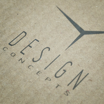
Case Study: Design Concepts

August 21, 2011SheilaCase Studies5 Commentsbranding, case study, client, competition, custom, drywall, Logo Design, niche, outside the box, process, simple, sketches, unique

I’ll let you in on a little secret. Logo design used to be my least favorite thing in the world. Used to be. Now it’s starting to grow on me. Sure, I love a good logo. Who doesn’t? But designing them…for some reason that’s the Holy Grail of good design. But for me that’s always been an area where I’ve lacked real confidence. Why? Probably because of the amount of weight that one little symbol…

Read More

I Heart Helvetica

June 14, 2011SheilaGeeky Stuff, Random1 Commentdesign, font, Helvetica, Logo Design, simple, versatile

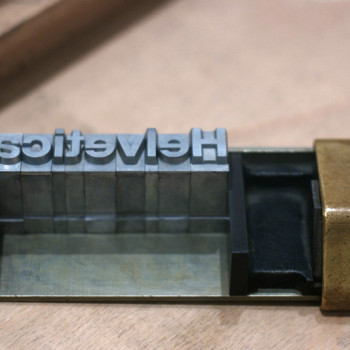
Helvetica. A font by any other name…. You either love it or hate it, or you don’t know what I’m talking about. For the latter group, Helvetica is a sans-serif (and if you don’t know what that  is, we’re really in trouble) typeface designed in 1957 by Swiss typographer Max Miedinger and Eduard Hoffmann. It became an instant sensation and now it’s used for everything from government forms to street signs to logos. The rest…

Read More

Recent Posts

  • The Real Reason Why Your Emails for Design Jobs Are Ignored
  • How a Mobile-Friendly Website Keeps You in Business
  • Smart Brands Use These—and Why you Should Too
  • What Star Wars: The Force Awakens Got Wrong
  • 25 Ways to Tell if You’re a Graphic Designer

Popular Posts

How Long Does it Take to Design a Logo?

14 Proven Ways to Find Clients

10 Reasons Why a Logo Should Never Cost Less Than $200

Good, Fast, Cheap: Yes, You Can Only Pick Two.

Don't Fall for These 6 SEO Mistakes

How to Snag Quality Clients

The Importance of Color in Logo Design

Categories

  • Branding
  • Business Tips
  • Case Studies
  • Freelancing
  • Geeky Stuff
  • Graphic Design
  • Logo Design
  • Marketing
  • Random
  • UX
  • Web Design
  • WordPress

Tags

audience bad logos blog brand branding business business goals cheap design client clients college color competition custom customers design economy education experience freelance freelancing Google graphic design history identity investment logo Logo Design marketing money niche process professional project red flags SEO simple skills social media unique value versatile website websites work

© 2016 Apex Creative. All rights reserved.